Lesson 11: Using visual contrast to increase readership
All about how your copy looks, and why it matters
Although this week is primarily about writing bullets, it is also about contrast. And visual contrast is an enormously powerful tool you should know about when writing any kind of copy — bullets included. Like all powerful tools, it is able to work for your copy...or wreck it if you don’t know what you’re doing.
Visual contrast = visual interest
When you see something that looks different, your brain “refreshes” and goes into “new content” mode. You perk up and pay attention.
This is obvious when you think about it — but it’s especially important when Sam is reading.
Since we’re hardwired to be very visual creatures, the appearance of text on the page has a huge effect on how (and if) he reads it. If you can add visual contrast to your copy, each new element will refresh Sam’s brain, and he’ll find the copy much more inviting to look at, and much easier to read.
Notice how the paragraph directly above is longer than this one? And the one below?
If you scan through this page, and through all the lessons previously, you’ll see that very often, longer paragraphs follow shorter ones, and shorter ones follow longer ones. Sometimes there’ll be a couple of short ones followed by a couple of long ones, or several long ones broken up by one short one. Or long, longer, short, shorter etc.
There’s no hard and fast rule, except to try to produce variation in the text.
Now, sometimes paragraphs will be similar lengths simply because the content demands it. But the basic principle of “mixing it up,” maintaining visual interest, and avoiding the appearance of monotony is something so important that I incorporate it into my copy fairly as a matter of habit, wherever possible.
It just helps keep Sam reading comfortably.
This is particularly true in bullets. Sometimes people use alternating bold and normal fonts for bullets. I actually think this is a crappy way of producing visual contrast — a holdover from printed sales letters where you couldn’t use color to achieve the same effect. Using bold like that implies that every second bullet is more important, which isn’t the case. But the principle is sound: by changing the visual appearance for each new bullet, you get Sam’s brain to refresh, rather than staying in “same content as before” mode — which would make him scan over and ignore many of the bullets.
The rule of four
There is a widely-held belief that the human brain can take in a maximum of seven items. So most copywriters say you should use seven bullets at a time before mixing things up with a subhead or whatever.
This belief is based on a misinterpretation of a side-note in a study of an entirely separate psychological question. The actual number is four: the human brain can usually take in 4 items before it becomes “full” and starts discarding entries.
This is very important to understand because Sam’s lizard brain knows it. In fact, his lizard brain is a sophisticated filter that will automatically tune out stuff that looks like hard work. The lizard brain is happy with one, two, three or even four items. It can quickly parse them, and it sees that Sam won’t have to work hard to consciously make sense of them. But more than four items it will generally treat quite differently.
This is why, as a rule, more than four items in proximity tend to “blur together” and you don’t really notice any particular one of them.
I suggest you only use four bullets at a time. (Same goes for navigation items if you can manage it.) Breaking up bullets into sections of four, separated by headlines or other paragraphs of text, adds to the visual contrast of the page, and makes it more likely everything will get read — or at least skimmed.
And of course, alternating the color and length of the individual bullets themselves helps too.
This also works on headlines. Typically I try to keep headlines short, and then follow them with a longer subhead. That in turn can be followed by a longer opening paragraph, and then a short sentence followed by another longer paragraph. This is not a hard and fast template, but it does help to “gradualize” Sam into the copy, asking only a small reading commitment in the headline, and easing into longer copy as he goes.
Mostly, I want you to be thinking about this principle today, so you can practice it when you write your bullets in the next lesson. Once you’ve gotten the hang of it, and have been doing it for a while, it’ll become second nature.
Homework
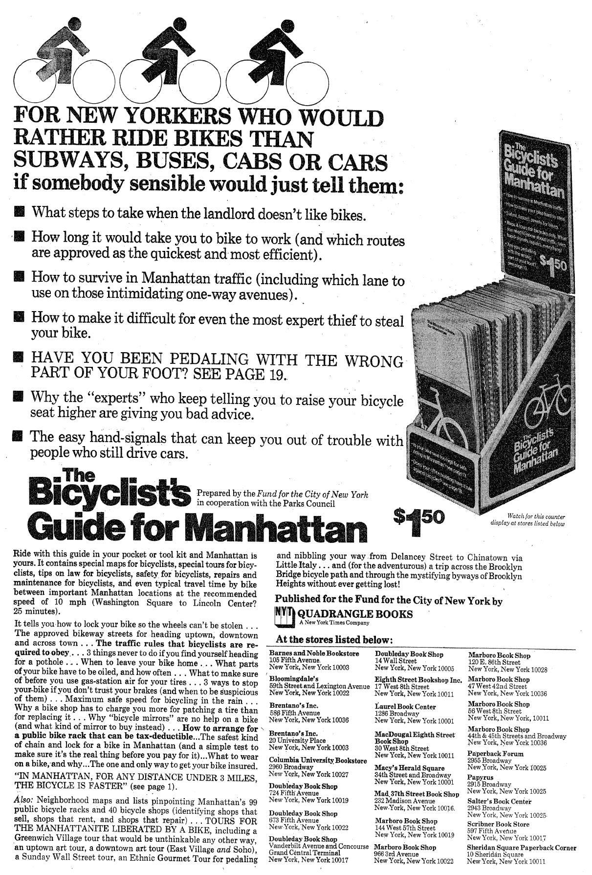
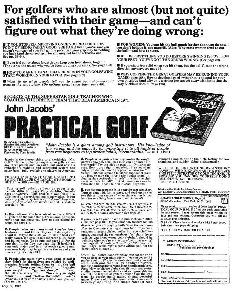
There aren’t any exercises you need to do today. Instead, to help get you thinking about writing your own fascinations, I’d like you to read these two classic Mel Martin ads. Make a note of how they build curiosity, and also the ways they use visual contrast to encourage readership. (Sorry about the image quality on the second one...I trust you’ll make do.)


