Lesson 4: The three qualities of clarity
All about clarity & CTAs
Note: Starting in this lesson, you’ll often see real-life examples that illustrate the principles that you are learning. These examples are collected from various websites over the years. I make no effort to update them, as when they are from is of no relevance to what they demonstrate. People are making the same mistakes today as they were in 2010.
Last time you learned about the importance of the 4C Cipher, and I introduced you to the first C: clarity.
Hopefully by now you’ve been able to winnow out a few of the CTA lines you wrote in lesson #2, by getting rid of the point-middle and “clever” ones.
Today, you’ll learn the three objective qualities that characterize clear copy. This will form a basis for finally refining your CTA into a three-line masterpiece, next lesson.
Quality 1: precision
This is probably the most obvious quality of clarity. Precision means being very particular or specific about your message.
If you are imprecise, if you fail to accurately convey your meaning, if you leave the door open for Sam to interpret you in multiple ways, you’ll pay the price in lost conversions. Let’s start with some simple examples from headlines, before looking at calls to action:
The best email marketing tool [Benchmark]
Easy email newsletters [MailChimp]
I think MailChimp’s headline is far more precise than Benchmark’s:
Firstly, the word “easy” carries greater precision than the word “best.” Indeed, “best” must be one of the worst adjectives in marketing — a way of letting your customers know that, although you think your offering is wonderful, you just couldn’t come up with any precise reasons for your opinion. It is such a subjective term that it is hopelessly ambiguous. One man’s treasure is another man’s trash — so what is “best” for a computer-illiterate plumber’s email marketing needs is probably not going to be very useful to me; and my own ideal system will certainly not be best for him. By contrast, “easy” tends to be similar for everyone, and certainly at least explains how — that is, the precise way in which — MailChimp believes they are best.
Secondly, MailChimp is tightly-focused on Sam’s chief need: writing newsletters. An “email marketing tool” is a much vaguer term. It is more expansive, so it may appeal to a certain segment, but it is also more ambiguous. MailChimp knows what their customers want, and speaks about it precisely.
As much as I despise MailChimp, and as much as their own business has changed in the years since this headline was written, they are still writing tight, precise headlines. And Benchmark is still making the same mistakes with vague, puffy, grandiose claims that could mean anything:
The Quickest Way to Grow [Benchmark]
Turn Emails into Revenue [MailChimp]
Being precise means revealing more information rather than less
You don’t necessarily need a greater number of words to be more precise. You just need precise words. For instance, notice how tight MailChimp’s headlines are; each word pulls its weight. Benchmark’s are less precise, yet have more words.
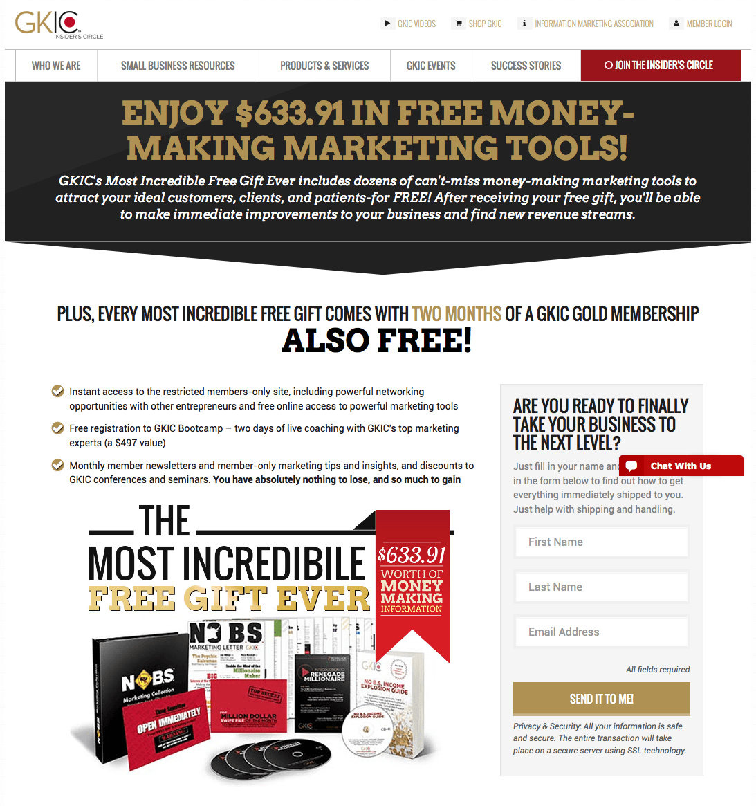
Let’s turn from demonstrating the principle with headlines, to looking at CTAs specifically. Here’s an example from GKIC. You could make this button significantly more precise by perhaps adding only one word:
We’ll ignore the way this page has four distinct headlines competing for attention. And how they misspelled “incredible.” And that there’s a chat dialog sitting over the sidebar.
The issue I want to draw your attention to is the button copy: “Send it to me!”
On the face of it, this is good copy — it starts with a verb, and it’s written in the first person.
But think back to the critical, non-negotiable rule I emphasized in lesson 2: what will happen when Sam clicks? He needs to know what he will get, and how.
Do you see the problem? Send what to me? And how will it be delivered?
Many companies (especially in the tech world for some reason) are so enamored with ultra-short landing pages that they are slaughtering precision on the altar of brevity. Here’s an example from Campaign Monitor. Their headline used to read:
Email marketing software for designers and their clients
Then they changed it to:
Elegantly simple email marketing
The latter is shorter, no doubt — but the former is only eight words! A perfect length for a headline...and it calls out their ideal customers much more precisely.
Do you think designers would be more likely to consider Campaign Monitor, or prioritize it in their minds over other solutions, if they clearly understood that it was created with them in mind? Surely they would. This is exactly the formula used by one of the twentieth century’s most successful copywriters, Mel Martin. The majority of his ads started with a callout of this nature:
For golfers who are almost (but not quite) satisfied with their game — and can’t figure out what they’re doing wrong
For adults who would love to pick up their education where they left off...
For everyone who has ever felt mad enough to write a letter to The New York Times
(Martin’s ads also make very strong use of a second of the 4Cs, which we will look at in Module #2: connectivity. For instance, the use of the word “For” is clever because it begins a thought which is not completed by the end of the headline. Even though the promise being made is completely unexplained, the strong relevance to a particular group of people makes them want to see how the reasoning continues. More on this when we get to writing headlines in a few weeks.)
Quality 2: concreteness
What do I mean by “concreteness,” and why did I pick such an awkward word? There really is no other word precise enough to describe the specific feature in question.
Concreteness helps Sam to effectively “see” and “feel” your message. It’s about creating a vivid mental picture.
This is critical to making your message real to Sam — and one of the chief ways in which most marketing copy drops the ball.
Before I get to CTAs specifically, let me explain concreteness in general. One excellent technique for it is the use of stories. Stories are like the nuclear bombs of marketing. So understanding how they make a message seem real will be very helpful to understanding concreteness. I’ll only say enough to illustrate the point, because we’ll study story separately later on. For now, here’s what you need to know:
Most people believe plot is the essence of story. This is not the case at all. Stories are successful ultimately because they stimulate our emotions — they’re an external aid to creating emotions we’d otherwise find hard to create on our own, ranging from fascination to excitement to suspense to anger to sadness to joy, and so on. But we don’t get emotional about plot. We get emotional about people. Plot is powerful only because it optimizes the order in which events happen to the characters, so as to produce an emotional payoff. Ultimately, story is driven by character — by a person or persons we can relate to in some way. The plot is just a progression of events that raises the stakes for that character, to increase the emotional intensity.
That’s why when you watch Sharknado (as everyone should) you kind of want all the characters to die just for the hilarity of it; but when you watch Jurassic Park, which has a very similar plot, you feel exactly the opposite. In Sharknado the characters don’t seem real — that’s actually part of the point. In Jurassic Park they do.
You’ll notice that many very successful marketing stories have no plots. The realness, the concreteness, is driven entirely by a single, engaging character. Someone Sam can imagine being like.
The most interesting man in the world (Dos Equis)
The Old Spice Man
The man in the Hathaway shirt
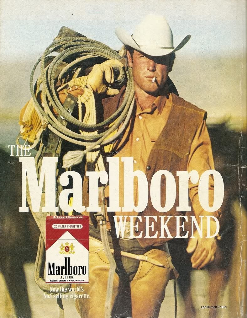
The Marlboro Man (below)
Story doesn’t have to be explicit. It can be entirely created in our minds by implication — and because we create the story ourselves, in some ways it is even more powerful.
I’d be remiss not to use the perfect example here from Seth Godin:
All marketers are liars.
Four words that create a powerful story in our minds. Here is another, attributed to Ernest Hemingway:
For sale. Baby shoes. Never worn.
And of course, the old joke:
For sale. Used parachute. Unopened. Small stain.
These examples give us some sense of what is involved in creating mental pictures; of making your message real. You must pick something Sam cares about (typically the problem you solve), and find a way to place him into it. This can be through relating to a character, but of course, it can also be simply by imagining himself getting and using your offering.
Which is exactly what you want him doing when he is at your CTA with his finger poised over the button.
Here are a couple of practical steps you can take to make your language more concrete:
Use concrete, specific words rather than abstract, vague ones. Concrete means that it describes something physical, and does so directly. For instance, “boss” is a word that creates a clear mental picture; “superior” does not. “Eat” is much more forceful in most circumstances than “consume.” (Incidentally, this is why “click here” is still a powerful phrase despite its rampant overuse, and the fact that it doesn’t convey any value!) If you know a bit about language, aim for Anglo-Saxon words over Latin ones. But the origin of the word is less important than how punchy and easy to visualize it is.
Focus on common nouns and verbs. In case you’ve forgotten junior English, nouns are things, and verbs are actions. A lot of people think the heavy lifting in copy comes from adjectives and adverbs — words that describe. “Easy email newsletters,” for instance. But as we have seen, these are frequently your enemy too (“best”, “elegantly”, “quickest”). The concreteness in language doesn’t generally come from these kinds of words. It comes from describing things that Sam can visualize. This means talking about common material objects (including people of course); and common actions being done to them, or by them.
Here’s a table of a few common CTA words, with some suggestions for how you could make them more concrete. These wouldn’t work in every situation, but often that’s just because the rest of the page is limp and generic. If you frame the CTA with copy that dares to use language in an interesting and conversational way, you’d be surprised what you can get away with. (More on that in later lessons too.)
“Default” word      Suggested concrete replacement
--------------------------------------------------
Send                Email
View                Look
Start               Kick off
Try it free         Take it for a spin
A quick tip to think about for later: using different words like this also leverages another of the 4 Cs: contrast. A very powerful principle we’ll look at next week.
Here are three examples of actual CTAs I’ve collected. I have ordered them according to how well they evoke a concrete and interesting vision of using the product. Do you see it?
Quality 3: simplicity
Simplicity, like concreteness, is actually quite hard to nail down. You know it when you see it — but we often have a hard time keeping our language, web-pages, and campaigns as simple as they should be.
The longer I’ve spent writing copy, the more the ol’ KISS principle has seemed paramount. And I’ve come to think of simplicity in terms of economy and straightforwardness:
Economy: Is the message as long as it needs to be; no longer? Is it succinct? Does every word contribute so that, if I removed it, the message would genuinely be reduced, or even become incomprehensible? Are there any wasted words, any elements not doing the maximum work possible (which often is a matter of precision)?
Straightforwardness: Is the message as direct, candid, and plain as I can make it? Am I using words Sam is certain to understand very well? Not just words he’ll be familiar with, but ones he would use himself? Am I using short sentences? Am I connecting them in a logical sequence?

(One of the best ways to ensure straightforwardness is to be very careful about how you describe and link ideas to gradually build a complete picture. We’ll talk more about this when we look at connectivity.)
You’ll notice that simplicity and precision are in tension. If you go to extremes with either, you end up being very confusing to almost everyone. Too much precision and you end up being dry, long-winded and boring — like a technical treatise. Too much simplicity and you end up sounding condescending, like Sam doesn’t understand multisyllabic words. You also end up being very vague, which is a clarity-killer. Like this:

In other words, you need to exercise judgment in balancing precision and and simplicity.
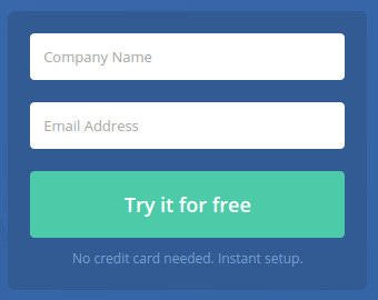
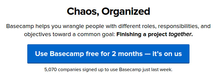
Okay, let’s close off with a call to action button that I think captures clarity very well. It is precise, it is concrete, it uses simple nouns and verbs, it is straightforward, and it is economical:
Homework
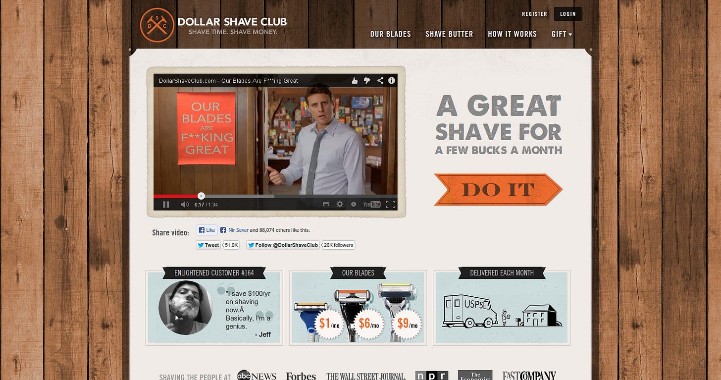
Your homework for today is simple: you’ll be rewriting the calls to action marked figures 1-3 above. This will help to cement the qualities of clarity we’ve covered.
Rewrite the GKIC CTA button to reflect what Sam gets, and how.
Rewrite the Dollar Shave Club CTA to reflect what you think should happen when Sam clicks.
Rewrite the Lumosity CTA to reflect language Sam would be likely to use.
Here are the answers I came up with (no peeping until you’ve tried it first):
.
.
.
.
.
.
.
.
.
.
.
.
.
.
.
.
.
.
Ship me the free DVD bundle!
Mail me some f*cking great blades
Play a game to smarten me up


