The final piece in the design puzzle is your call to action. In terms of FRODO, it is the last stage of Sam’s thought sequence — the point at which you offer him something.
You already know how to write CTA copy; but that won’t have much benefit if you don’t present it effectively. There are three basic principles you need to know around this:
1. Placement
Much is made of the “best practice” of putting your CTA above the fold. But in some tests, the CTA performs vastly better below the fold.
Again, best practices are just pooled ignorance.
Why do some pages convert better with the button out of view? Isn’t it true that only 20% of users scroll past the fold? Well, yes — but surely you could have predicted that, knowing that only 20% of users read past the headline!
The reason many pages turn out a better response with the CTA lower is very simple: thought sequences. You must make your offer at the point on the page where Sam wants it. Is your offer logical given what he currently knows and feels — or are you asking for a commitment he’s not yet ready to make?
For instance, to take the classic landing page example, you’ll very often find that one of the objectives on company homepages is to buy something. This is illogical — like asking Sam to buy as soon as he walks through the door of your office.
Wouldn’t you get him to speak to a salesperson first? By the same token, wouldn’t you get him to read your copy first?
However...one of the difficulties of web design is knowing when Sam will be ready to click the button. Not only is there no one-size-fits-all solution for a given page, but there is no one-size-fits-all solution for a given prospect. Different prospects will be differently motivated. On an opt-in page, for instance, with a low-commitment offer and a decent amount of context, Sam may be ready the second he arrives, or immediately after reading the headline. But in some cases, for some Sams, he may want to know enough about your offer that it would push the CTA below the fold.
On a sales page things are even more difficult. Any given prospect may become convinced to buy at any given point on the page.
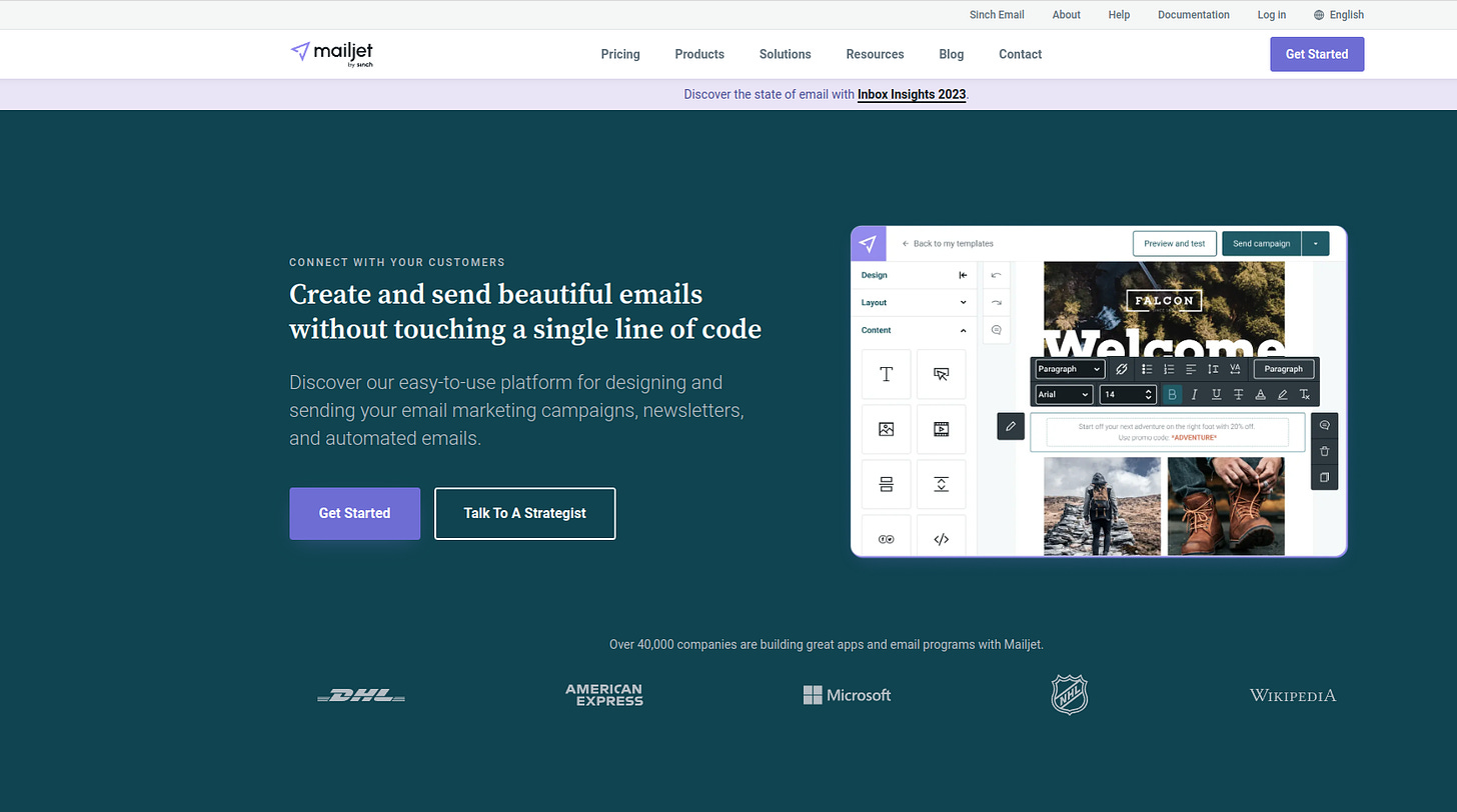
A standard way of dealing with this is to have the CTA always visible, so Sam can click whenever he is ready. This is generally achieved by having the button prominently on the nav, and making the nav itself sticky. Here’s how Mailjet does it on their homepage, for example:


Obviously a floating CTA is not always an option, depending on your implementation abilities, and other considerations — for instance, I have worked on landing pages where the chief value has come in the form of journalistic information. We deliberately left the CTA until later in the design to avoid the appearance of a typical landing page, as this would negatively affect credibility. In unusual cases like that, or where a floating CTA isn’t technically feasible, simply place the button at the end of each major section of copy.
2. Visibility
Keep reading with a 7-day free trial
Subscribe to Copywriting Night School to keep reading this post and get 7 days of free access to the full post archives.


