Lesson 5: Picking what to say (and when) in your call to action
All about completing your CTA
You should now be familiar with the following important factors for calls to action:
They’re generally best written in the first person, as if Sam himself were making the demand;
They mitigate hidden costs that Sam may be afraid of in view of the value pyramid;
They explain the benefit Sam gets, avoiding goal dilution and generic language (if you’ve forgotten what goal dilution is, refer back to that section of lesson #1);
They explain how he gets it; what will happen when he clicks;
They are written in precise, concrete, straightforward language that he would use himself.
Most importantly for our purposes, when you started writing CTAs, I told you to start long and then pare down — but not to delete your original wording. Now you will see why.
We want three lines of copy for a CTA:
One sentence to sit above the button
One line of main button copy
One line of supporting copy
This is where having all that longer copy will come in handy. You can reuse it for writing the lead-in copy (before the button) and the supporting copy (after the button).
Why three lines?
Sometimes it is not necessary; but it seldom hurts. Hesitation tends to be greatest at the point where Sam must decide to act. So this is the most important spot to emphasize anything that will reduce his perceived cost of acting, and enhance his perceived reward.
But to do that, you need more than one line of copy.
Here are some common anxieties Sam has at the point of the CTA:
“Is this going to take long?” Sam is in a hurry. He has web-induced ADHD. Anything that looks tedious and laborious he wants to avoid.
“Are they going to ask for my credit card details on the next page?” This is a real hassle. Even if he uses autofill services (and many people don’t; his wallet may be in the next room), it adds a significant layer of friction. Not just because of the extra step, but especially because it means that he has to make a large commitment right now: either he must accept paying, or must remember to cancel his free subscription before it ticks over to a paid one.
“Is this really something people go for?” Sam doesn’t like to be the odd one out. He doesn’t want to be a fool. He wants to know the action he is thinking of taking has been taken by others before, and has a proven record.
“Is the expense going to generate a sufficient return?” Obviously whenever you ask Sam for money, he needs assurance his money will return with friends.
“Can I customize my options before I hit the checkout?” This was the chief question I had to answer on the CTA for the original version of this program. Originally, I used radio-boxes to let Sam choose which tier of the course he wanted (self-directed or tutored). After this, he could hit a single CTA button to buy his selection. However, this was confusing because a single button implies single options. Multiple options should entail multiple buttons. This is why most price comparison tables today use a button for each tier.
You might well have identified other anxieties, and also other hidden rewards that you can play off, in lesson #2. These are just some common ones to refresh your memory.
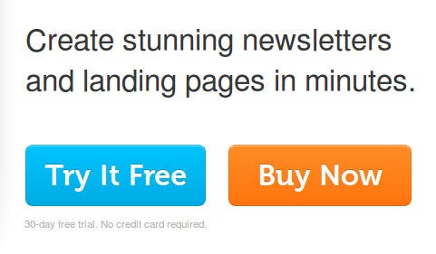
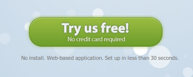
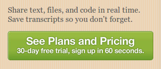
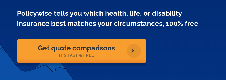
What you’re going to do today is separate out your CTA into three lines which connect logically together. Here are a few examples to illustrate, with some variations:
Okay, let’s talk about what to write.
Line 1: lead-in with key features/benefits
This simply states the main benefit you’ve identified that Sam is interested in. In many cases this is a feature that Sam is already looking for. Remember what you’ve learned about concreteness, precision and so on, and simply make a promise:
Your muskrat will be sleeker in seven days, guaranteed.
Get instant clarity on how to reach more customers.
Discover the top 5 industry secrets for financial security.
Peruse 1,103 cake-decorating tutorials 40 seconds from now.
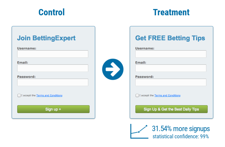
In case you’re wondering how important it is to state a benefit, here’s a split test for you. Notice the CTA doesn’t even have multiple lines — the benefit is just stated on the button. On a short opt-in form this can work well, but on a sales page it is wise to reiterate the major themes of your offer more fully.
Line 2: button copy explaining what Sam gets and how
This is the “CTA proper.” Remember to start with a verb, write in the first person, and be extremely clear about will happen when Sam clicks.
Lock in my free appointment
Phone me in the next 10 minutes
Mail me the eyes-only docket
Save my seat in the members area
Note how the first option, “lock in my free appointment,” contains a compromise. It is more concrete than the obvious alternative “schedule my free appointment,” but less precise. These sorts of choices are really judgement-calls unless or until you are able to split test them.
Line 3: supporting copy defusing anxiety
The best way to defuse anxiety is simply by emphasizing something which contradicts or eliminates whatever FUD Sam is most likely to be feeling — whether that is fear about spending money, uncertainty about what happens next, doubt about privacy, etc:
No credit card required
Proceed to checkout
Takes 30 seconds
Privacy guaranteed
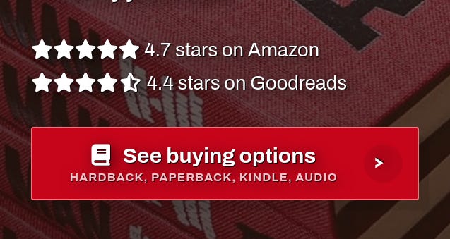
Here’s how I like to solve this problem for my clients, if I have the option:
And that’s it. Let’s get writing!
Homework
Your homework for this lesson is simple: finish your CTA.
Working with your best CTA lines from lesson 2, adapt them into a full, 3-line block of CTA copy.
Note: Write as many versions as you can and then sleep on them. A fresh eye will help you decide. It’s also smart to find someone who is a bit like Sam, and ask them which versions they find most interesting.


